11:31 am – favourites now updating properly
11:40 am – got the search input to update to the last query also on reopening popup. So now the popup can completely reload to the last state after opening or closing it.
Now I should get the font loader working in the popup also.
12.06 – have implemented the web font loader on the popup side. It is now avoiding the flash of unstyled fonts (FOUF) in the beginning, which happens if you dont use a font loader. Event the performance on the variants loading is better. There is still a FOUF fonts, but it is fast. Without the font loader what happens is:
- unstyled fonts is displayed
- invisible area, as new fonts are downloading
- new fonts displayed.
So there are like 3 different parts. With the font loader, only two parts:
- Unstyled fonts displayed
- new fonts displayed
The reason is the font loader only shows the new fonts once the fonts have donwloaded, so it avoids the invisible area part.
ok so font loading is fine now. Lets see how long it takes to donwload if all fonts are rendered. It has about a 20 second load time if we load all the font styles at the same time.
2.34 pm – Have got the viewport rendering working and looking good just now. Am using the library react-waypoint where we basically create a <Waypoint/> component, and it firses an event off when that component is loaded into the screen. e.g.
<Waypoint onEnter={this.handleOnEnter} />
It passes by defualt an event which includes details about the whole viewport. I found a way to bind a value to the function though, like so
onEnter = {this.handleOnEnter.bind(this, value)
Here I am passing item.family as value, since a Waypoiny is being rendered for each font family as the <FontList /> component iterates through the fonts list.
Have set an offset of -600px, so it also renders fonts that are up to 600 px below the viewport. Also, importantly have set fireOnRapidScroll = {false}. This means that if we pull the scroll bar say midway it will still only render the items in the viewport (+ the offset), as oppose to rendering all the items that have been passed during the rapid scroll. This gives us fast render times for all items in the viewport. If we leave fireOnRapidScroll = {true}, it gets very laggy as it firest an event for all items during the rapid scroll. It gets buggy, and laggy, so dosent work well, and setting the fire on rapid scroll to false helps prevent this and gives a nicer interaction.
So now the app is fully ready for first release! I just need to update the styling. Other feature I can include are:
- a details page for each of the fonts.
- ability to sort by thickness and slant. To do this I will have to parse the Google Font Page to see how it groups the fonts by thickness/slant, since there is no API to use that directly.
- a currently applied font section, which shows which fonts are currently being used on the screen, under which selectors, and the ability to disable them individually also.
For now I can work on the styling.
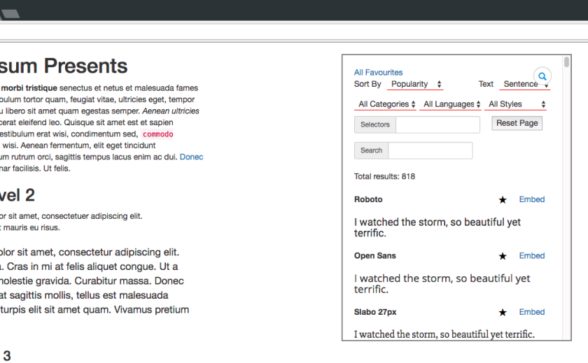
7pm – finished some styling work. See the photo above for current state.

